
What is it?
BEYO Bus
Designing a Flexible, Sustainable Shuttle System for Low-Density Campus Communities
End-to-End Design
Mobility System
Behavioral Design
Systems UX
Role
Product Designer
UX Researcher
Timeline
1 months for MVP, with 2 months of continued iteration


Overview
BeYo Bus is an AI-powered electric shuttle service designed to make sustainable commuting as convenient as driving. Through comprehensive user research and iterative testing with 50+ participants, I designed a mobile platform that balances individual flexibility with collective efficiency—reducing carbon emissions while addressing real transportation barriers for Cornell's Ithaca campus community.
The Challenge
How might we make sustainable transportation genuinely competitive with the convenience of personal vehicles?
1/4 of global carbon emissions come from transportation, yet existing solutions often fail because they prioritize environmental goals over user experience. Through research, I discovered the core tension: people's environmental intentions don't translate to action when sustainable options compromise convenience, safety, or time.
The Impact
- Designed a system that could reduce individual car trips by enabling flexible, end-to-end EV transit
- Created routing logic based on the "5-minute walk theory" to optimize convenience and operational efficiency
- Developed three distinct user flows addressing immediate, routine, and social travel needs
Understanding the Problem Space
I conducted mixed-methods research to understand this disconnect:
Research Methodology
Quantitative Foundation
50+ survey responses mapping transportation preferences and pain points
Demographic spread across Cornell's student and staff populations
Focus on current car users to understand barriers to switching
Qualitative Depth
10+ in-depth interviews with a diverse cohort of students, university staff, and occasional car users.
5 expert consultation with urban planning faculty
Task analysis of current transportation decision-making
Pain Points
Pain 1
Flexibility & Control
Every unreliable experience eroded trust.
One late bus → missed connection → missed class → stopped using the system
Lack of real-time info meant constant gambling. Will it be on time? Will it be full? Should I wait or start walking? This created planning paralysis: users built 30+ minute buffers into every trip "just in case."
What I Heard

"The bus says 'every 30 minutes' but I've waited 50. No explanation, just waiting. I felt powerless. Now I don't trust it at all."
— participant, graduate student
Design Direction
Return agency through reliable information, not unlimited options. Real-time tracking with accurate ETAs (not "5-15 minutes"), demand-responsive routing, proactive delay notifications. Users needed to feel respected, not controlled.
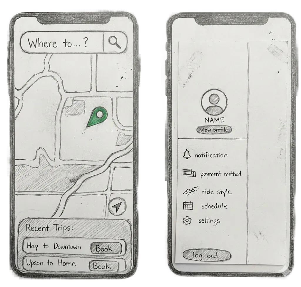
Specific Designs
- Real-time tracking: Know exactly where the bus is, every moment
- Accurate ETAs: Not "arrives in 5-15 minutes" but "arrives at 3:27 PM"
- Demand-responsive routing: System adapts to actual need, not fixed schedules
- Proactive communication: Notify users of delays before they leave home
- Flexible booking: Change plans without penalty, trust the system will adapt
Low-Fidelity Prototypes
What I Found Out
I noticed users hesitating, re-reading screens, and asking questions like "Wait, what's the difference here?" The booking flow was asking too much (too many decisions, unclear labels, hidden information). I needed to reduce cognitive load so users could book confidently without exhaustion.
What I Improved
Redesigning to anticipate needs rather than demand input
- defaulting to immediate pickup, labeling ride types clearly ("Fast Ride - Fewer stops, +$2"), surfacing seat availability so users wouldn't worry about being stranded, and making payment setup proactive instead of a surprise blocker.
Later testing showed the shift: 100% completion in 45 seconds with users relaxed instead of stressed, saying "This is actually easier than Uber." By respecting their time and mental energy, the system finally felt helpful instead of demanding.
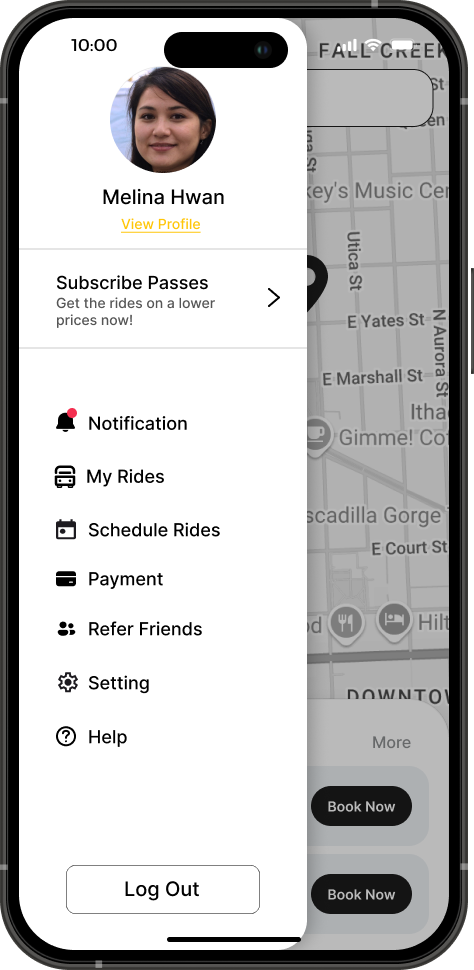
High-Fidelity Prototypes


Pain 2
Safety & Comfort
For many participants, women especially, it was about avoiding situations where they felt vulnerable. The anxiety started before boarding: walking to isolated stops after dark, waiting alone, traveling with strangers, zero accountability.
What I Heard

"I don't feel safe taking the bus at night, especially alone. I have to plan my entire schedule around daylight and cannot stay at studio to even finish my structure."
— participant, senior studying Architecture
Design Direction
A solution that doesn't address psychological safety isn't solving anything. Safety had to feel like traveling with a friend picking you up, not just "safer than before."
Specific Designs
- Transparency: Knowing exactly who is driving and who else is on the ride
- Connection: Traveling with familiar faces from the Cornell community, not strangers
- Accountability: Being able to share trip details with friends and family
- Control: Having the agency to choose who you travel with
Low-Fidelity Prototypes
What I Found Out
Testing with 10+ participants revealed users felt anxious tracking their bus—they could see it moving but had no ETA. One participant refreshed three times asking, "Did my ride actually book?" I needed to understand why the system wasn't building trust.
What I Improved
Redesigning around moments of doubt
- adding clear ETAs ("Arrives in 8 min") where users needed to decide when to leave, and explicit confirmation screens that acknowledged their booking ("You're all set for 2:15 PM").
In follow-up testing, the anxiety disappeared. Users stopped second-guessing and started planning, saying they finally felt the system had their back.
High-Fidelity Prototypes


Pain 3
Cost vs. Value
Students were choosing between bad options. The "affordable" choice cost them time and dignity. The "convenient" choice cost them money they didn't have.
What I Heard

"Last month I spent $180 on Uber. But when it's pouring rain and the bus takes 40 minutes... I can't lose that time."
— participant, undergraduate student
Design Direction
Specific Designs
- Predictable costs: Subscription passes that removed per-trip decision-making
- Bundled benefits: Competing with car ownership (monthly pass vs. parking permit)

What I Learned
1. Environmental Design Requires Behavioral Design
People want to be sustainable, but design must eliminate friction rather than rely on willpower. BeYo Bus works because it makes the green choice the convenient choice.
2. Complex Systems Need Clear Mental Models
The backend routing logic is sophisticated, but users shouldn't need to understand it. I learned to hide complexity through smart defaults, progressive disclosure, and contextual information.
3. Safety is Both Perception and Reality
Features like driver profiles and ride-sharing with friends don't change the objective safety of the service; but they meaningfully shift user perception and adoption, especially among women. Design must address psychological barriers, not just functional ones.